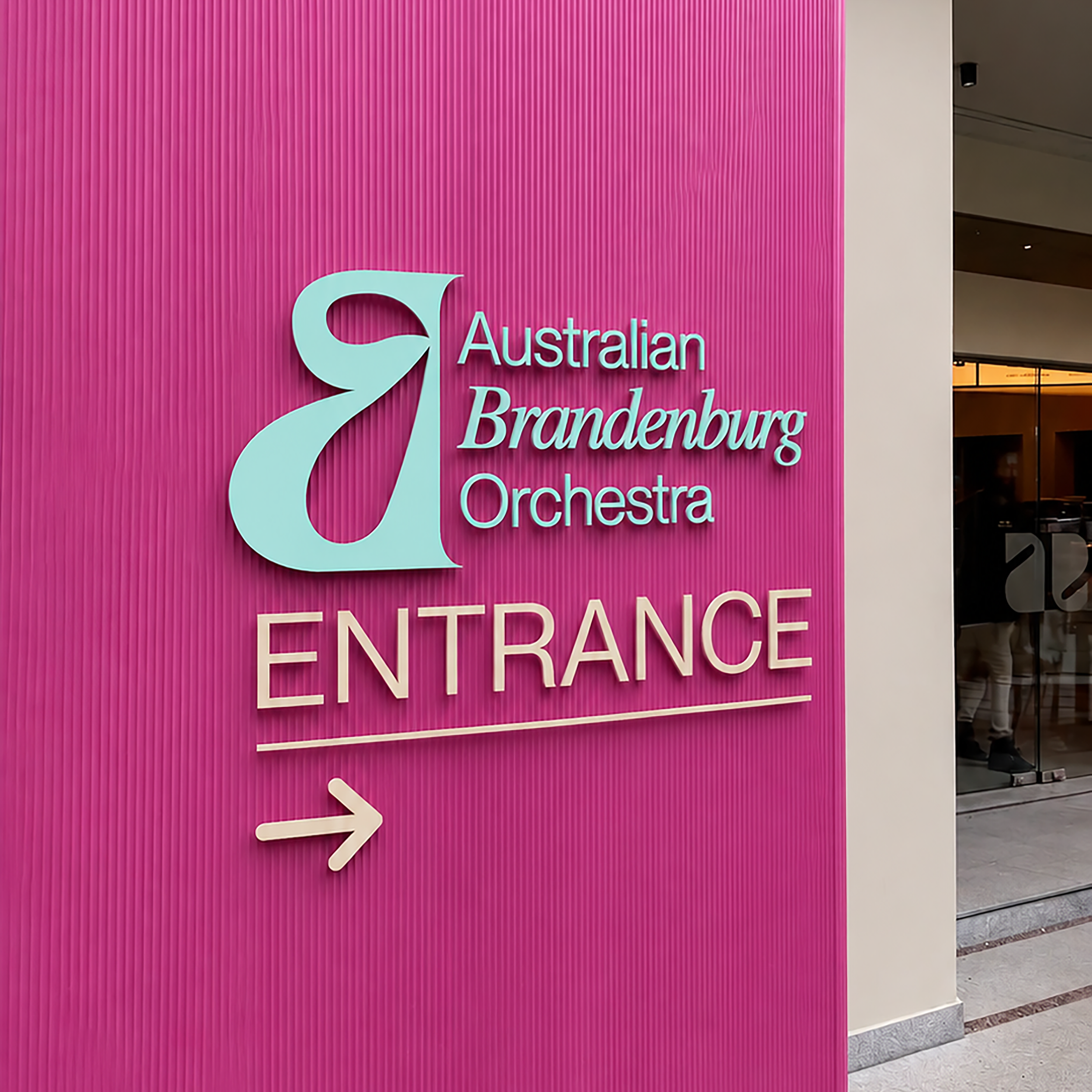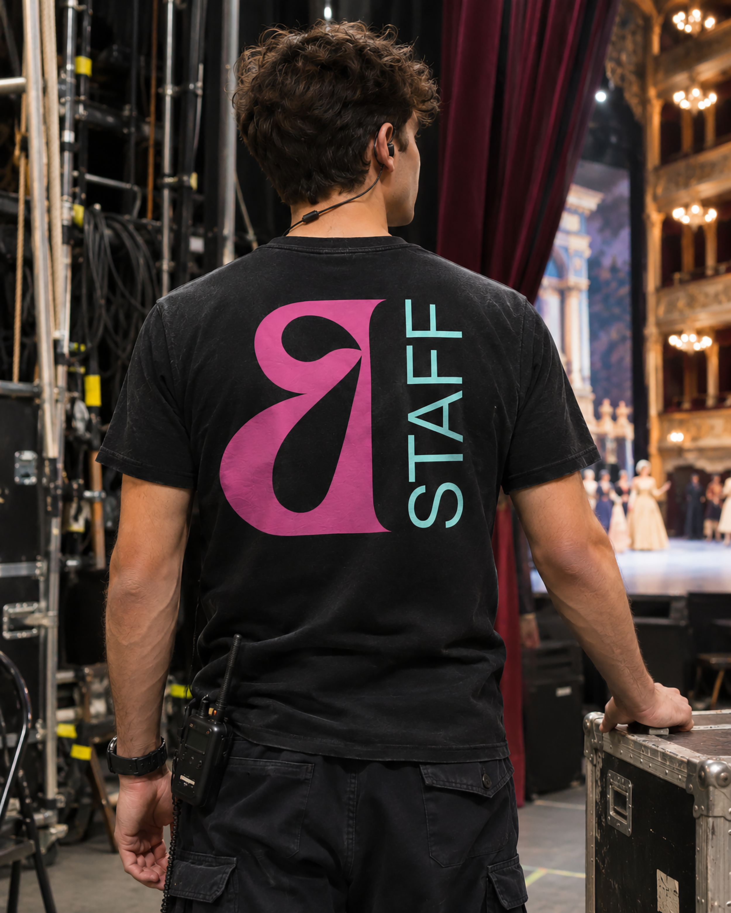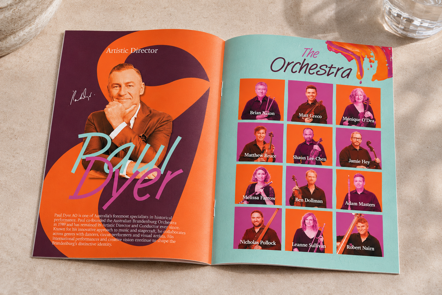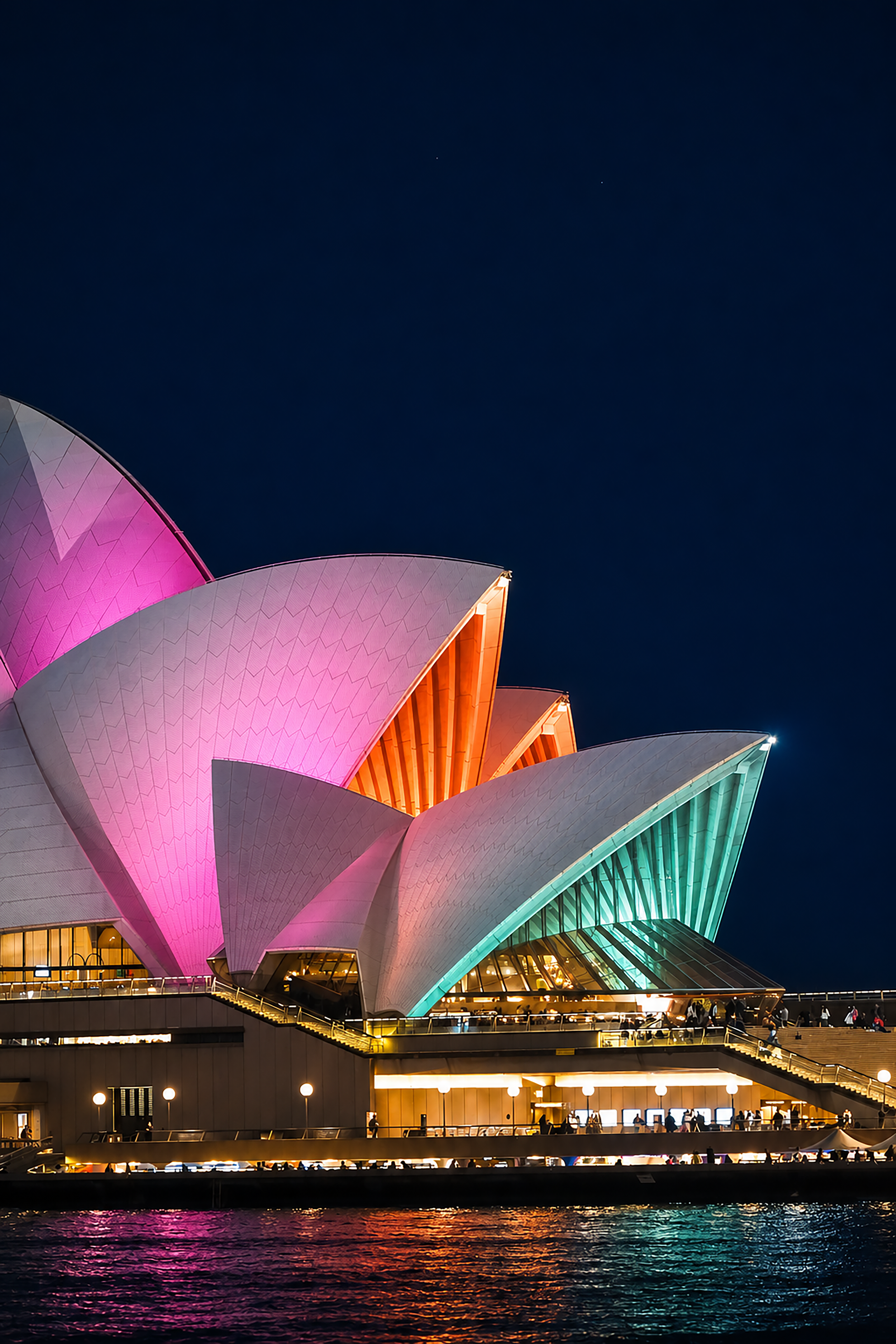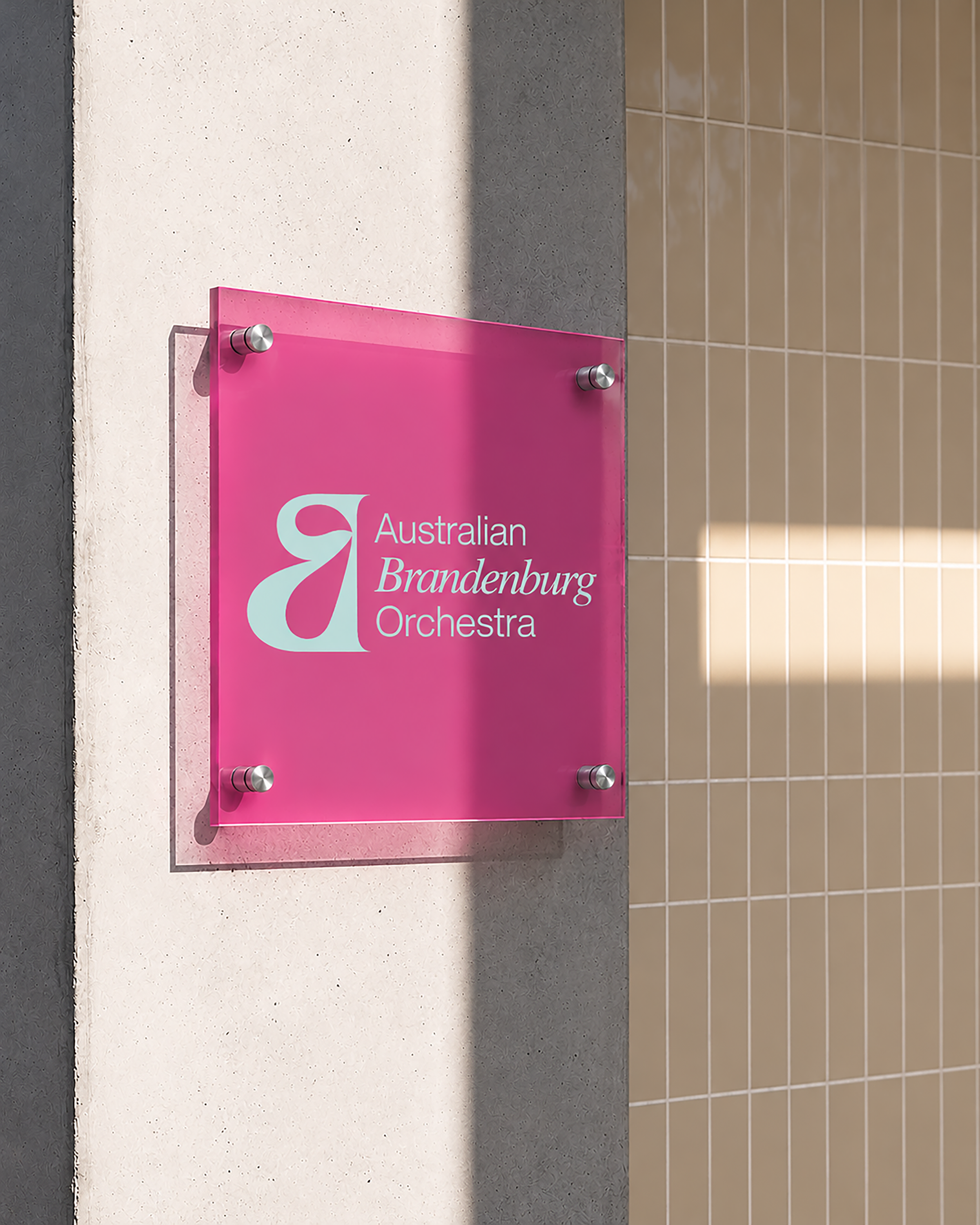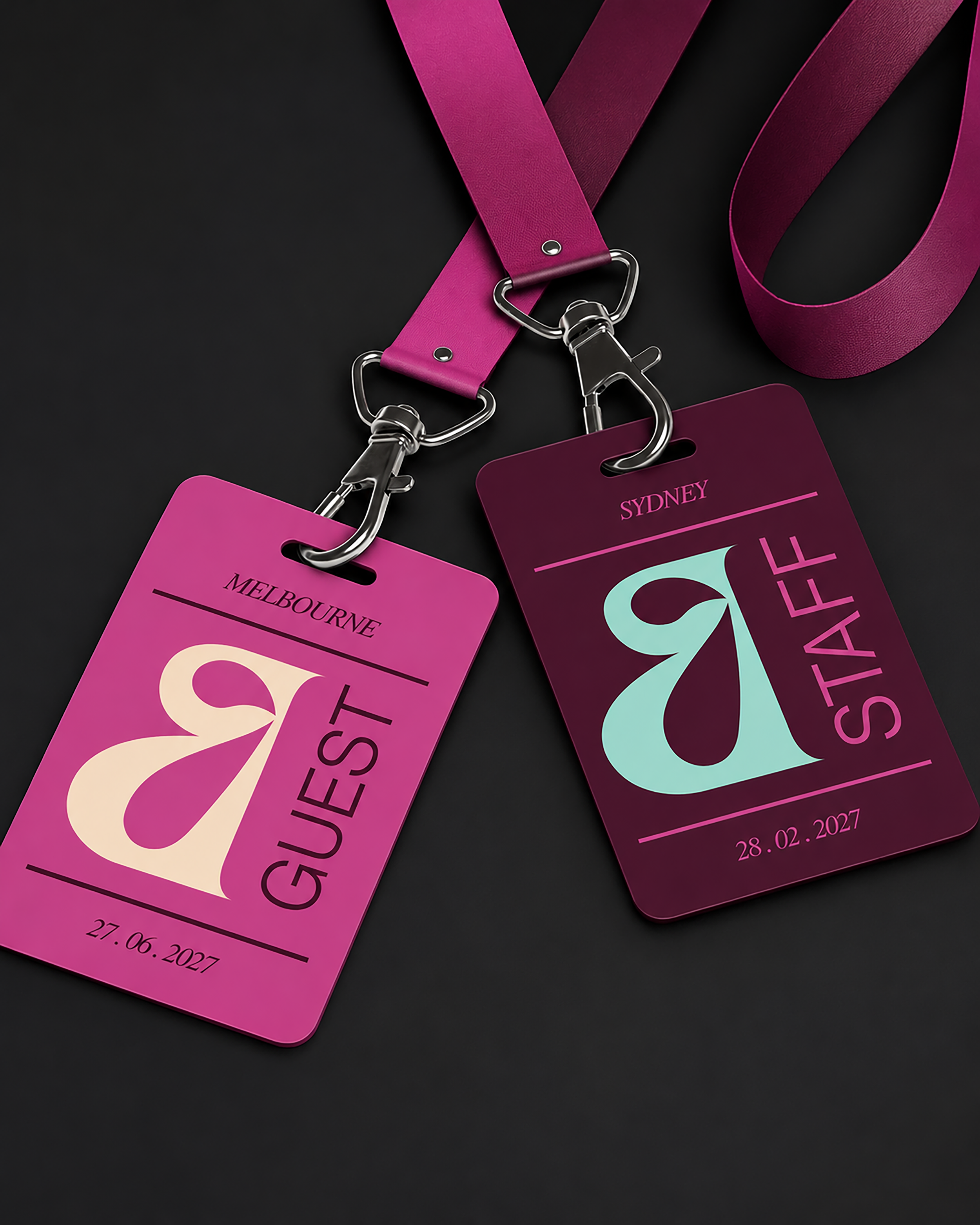

The Australian Brandenburg Orchestra was rebranded by preserving the orchestras musical integrity and classical history, whilst creating a contemporary look. In order to appeal to all generations the goal was to develop a modern, expressive and identifiable brand that captures the spirit of live peformance. An opportunity arose to challenge the visual ideals of classical music. Research established Brandenburg known for their powerful, dramatic, expressive and artistic interpretations of 16th century music. The redesign interpreted these words and provided a visual to what sound could look like. The identity focuses on artistic expression, movement and emotion. A visual link between sound and movement is created in thick layers of paint strokes that represent rhythm and the unpredictable energy of live music. A striking colour palette accompanies the visuals in harmony whilst not overwhelming the paint. Serif typefaces and clean grid structure maintain professionalism and the brands integrity. The 2027 seasonal branding program, posters, merchandise and collateral all used the same format and identity to create strong recognition. The ‘B’ is clearly identifyable without the full name which is effective for small print and merchandise. Layered textures, duotone paint strokes and a consistent typeface allows a versatile visual system that can adjust to different events and branding. The branding communicates the orchestras musical individuality beyond conventional orchestra stereotypes by striking a balance between classical legacies and modern expression. The concept creates a unique, flexible brand that appeals to both established and new audiences while capturing the emotional experience of live music. Colour, texture, movement and emotion are all factors of a live Brandenburg experience.