RiverDome
*
RiverDome *
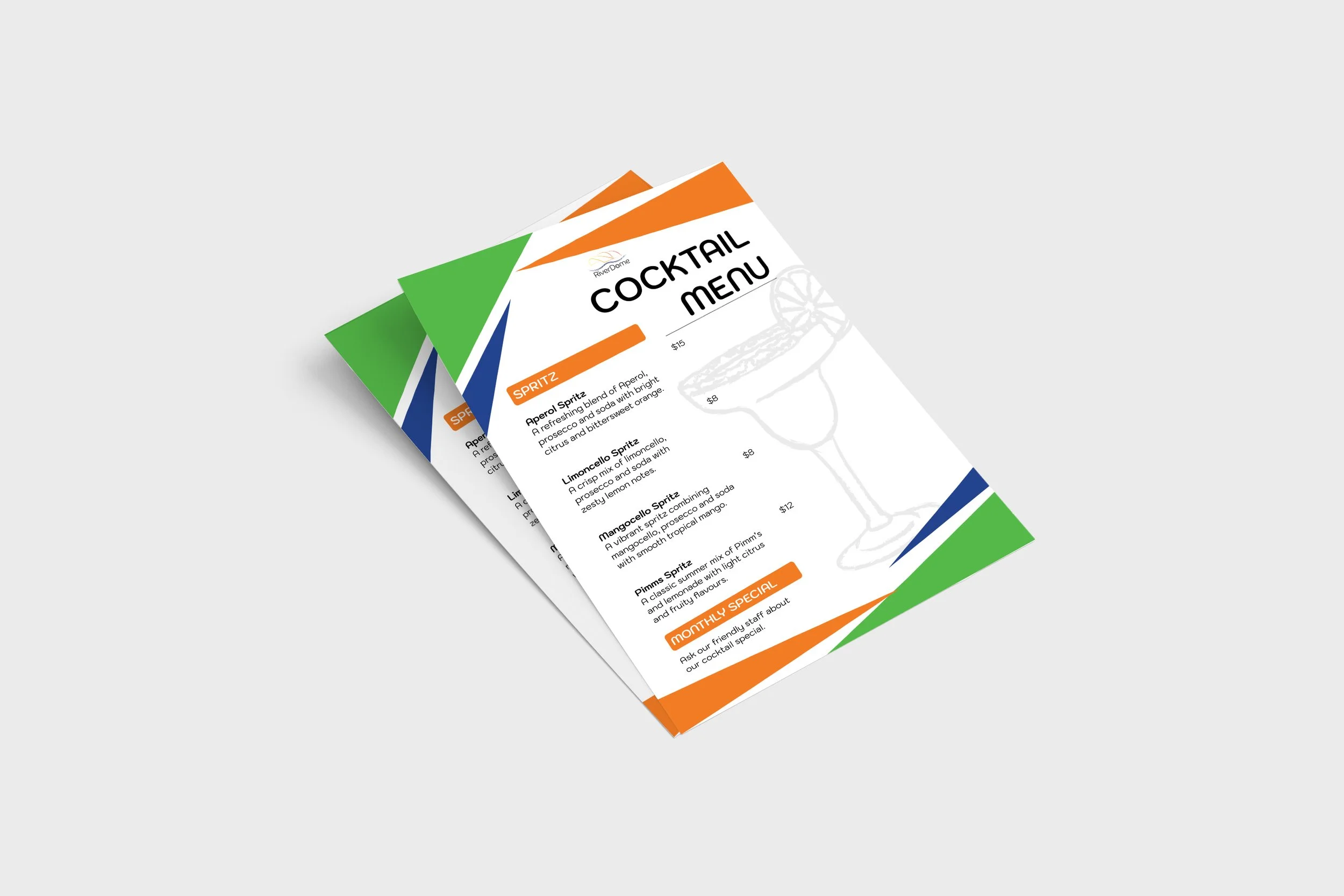
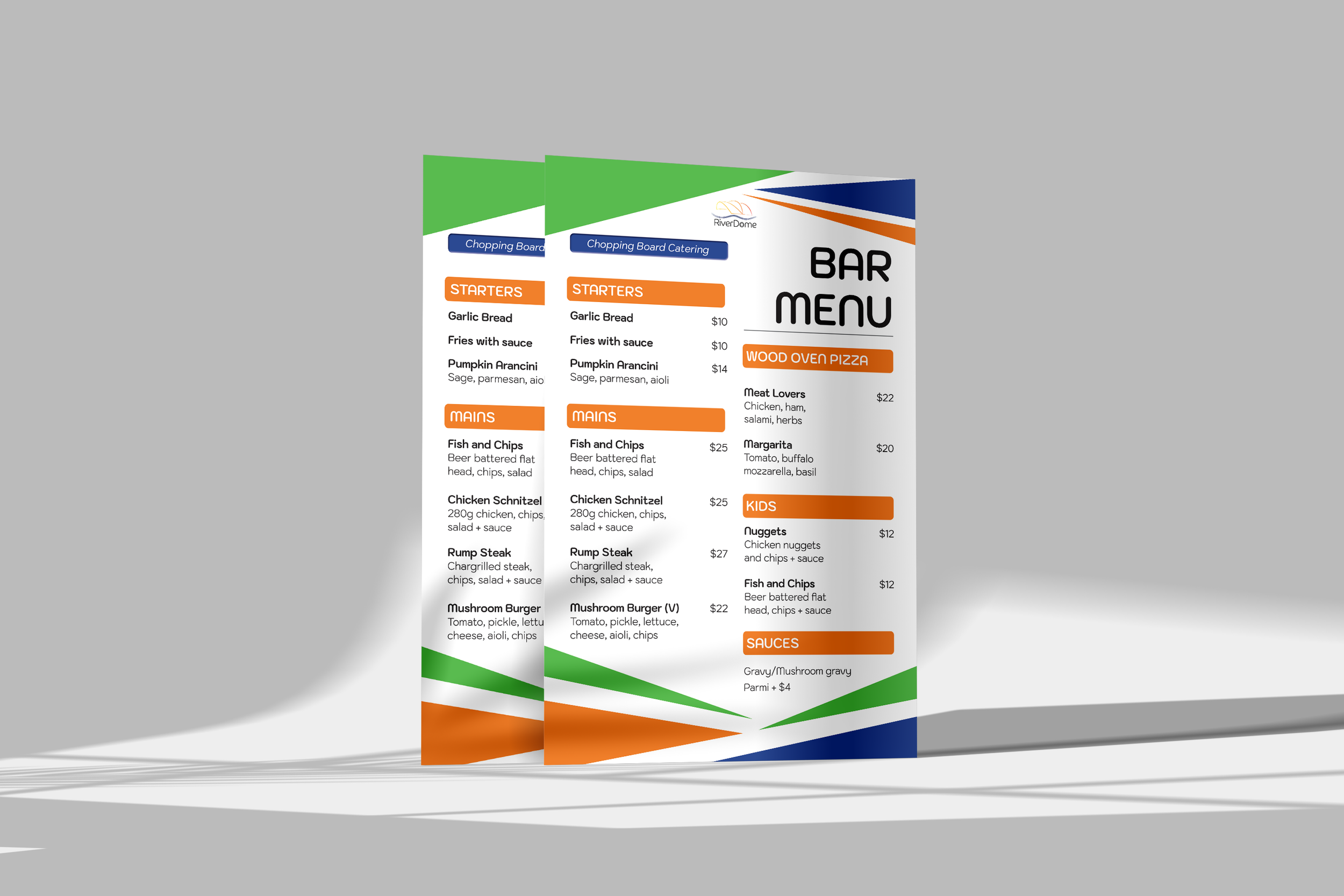
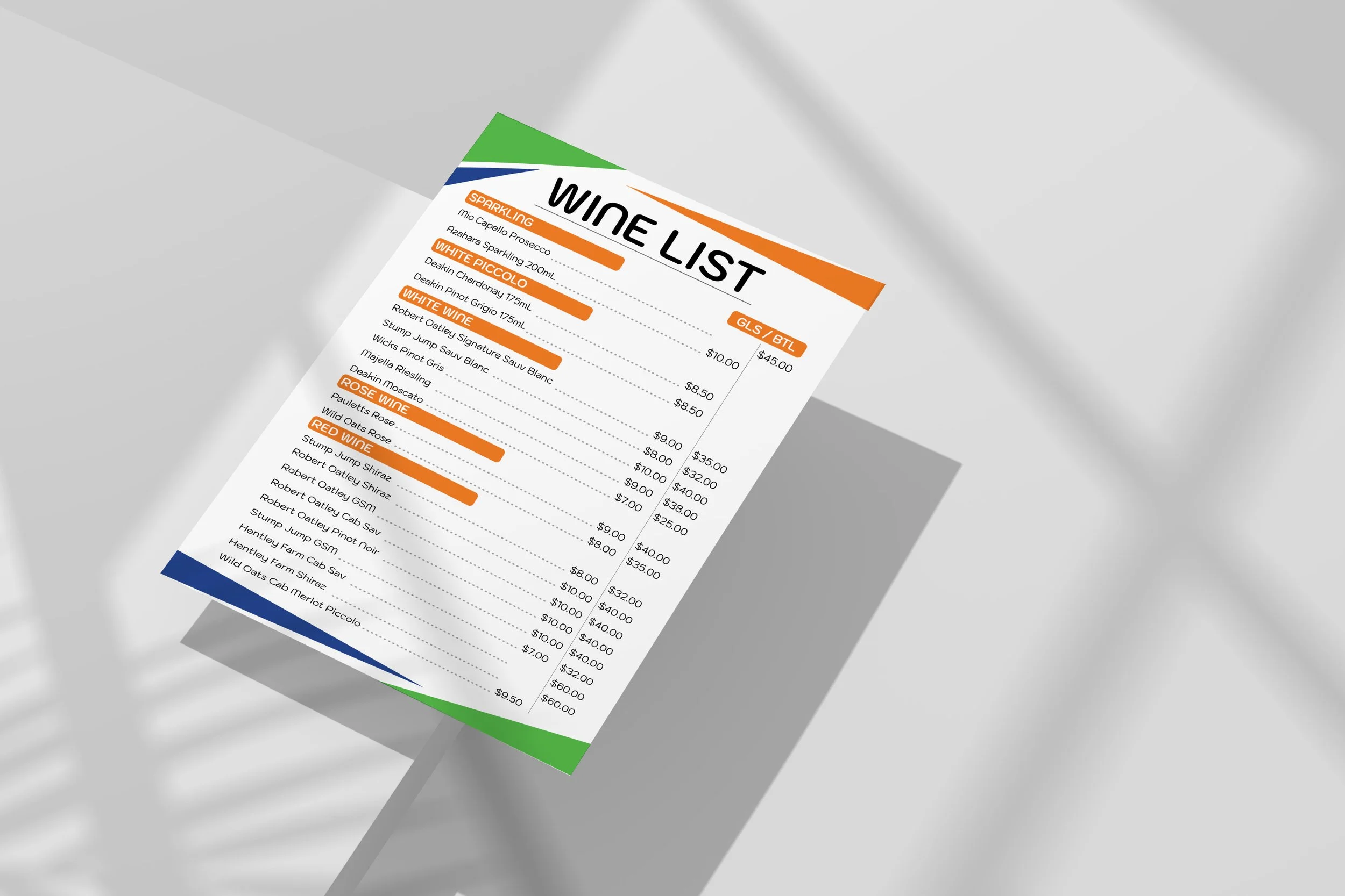
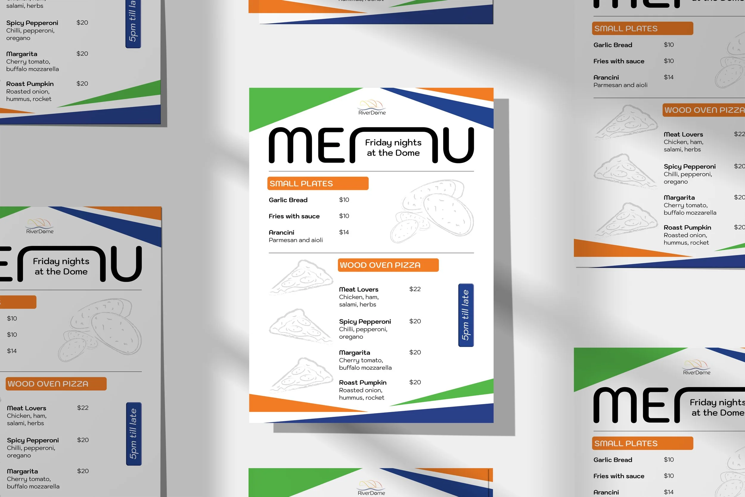
Re-vamping the brand identity for the relocation of Torrensville Bowling Club. Creating a vibrant, contemporary approach for a sporting community to attract new youthful demographics, whilst accomodating loyal members.
The geometrical concept is inspired by the relocation of the club. Orange is a great neutral demographic and sporty colour, whilst navy and green reflect the river Torrens and bowling greens. The pitched geometrical triangles represent the “dome”
- the highlight to the new facility in a contemporary and refreshing manner